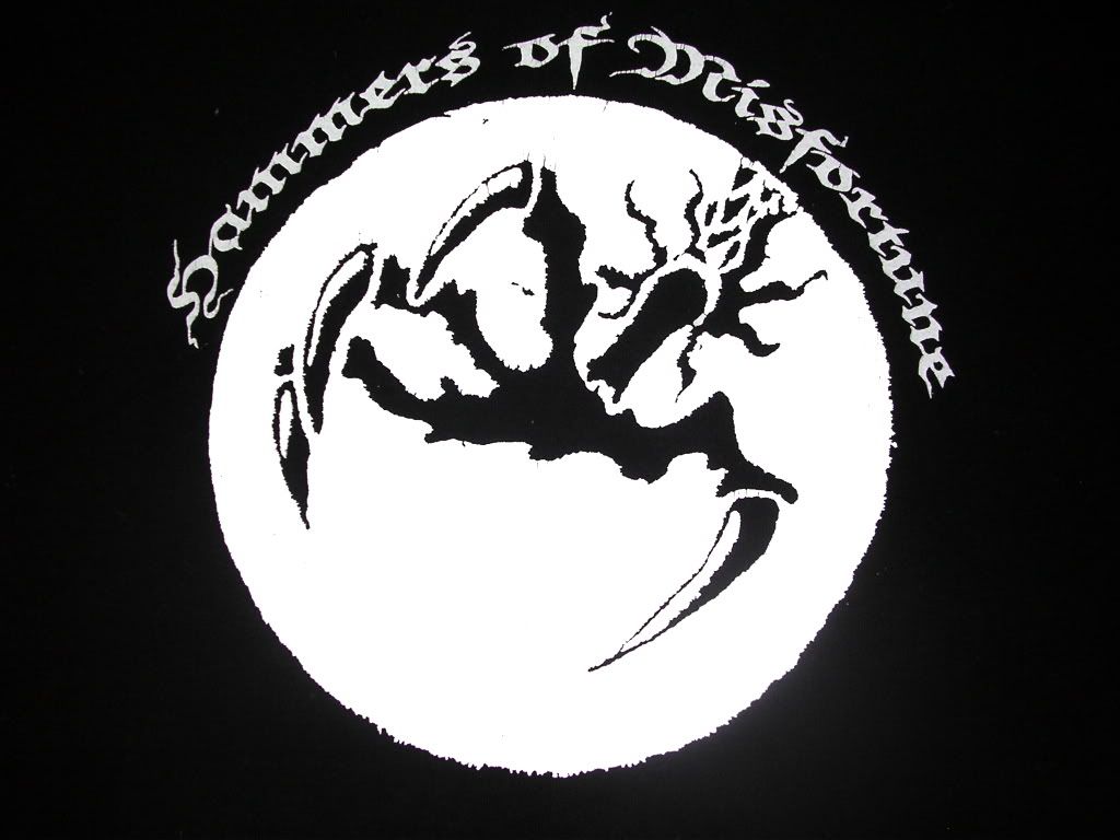
 One of my biggest complaints about the Internet has been the disturbing lack of quality images of the cover of Hammers of Misfortune‘s album, The August Engine
. The August Engine claw is by far one of my favorite logos, and is probably my favorite t-shirt too.
To see what this eclectic, bizarro metal band is all about, go to the Hammers of Misfortune Myspace Page and listen to the second track, A Room and a Riddle, which is off of the August Engine album.
If this band sounds familiar, it’s because their latest album, The Locust Years, scored #6 on my Top 15 Albums of 2006. I like The August Engine even better.
Hammers of Misfortune will always hold a sweet spot in my heart. During my Ohio State college days, I drove up to Cleveland to meet up with Brian and see them play at the Grog Shop in 2004. To our dismay, only 7 people were in attendance (this type of thing happens when a west coast metal band plays in a punk venue and there is absolutely no promotion). And you know what happened? They played their asses off in what was one of the best concerts I’ve seen to this day. I love this band and can’t wait for the new album.
 ANYWAY, I decided to solve this problem today. Right here, right now.
The best bet I had was to take a picture of my t-shirt and clean it up a bit. The pic at the top is a JPG of my shirt after it’s been cleaned up. You can see the white part of the claw is whiter than the words. Go ahead and clean those up if you want.
To the left is a vectorized PNG image of the claw with a nice circle around it. Since it’s vectorized, it’s not based off of a geometric formula and can be stretched to your desire. I also have EPS, SVG, and PDFs of it if you like – just contact me.
Finally, here’s a link to the original unmodified August Engine Claw picture from my t-shirt. And here’s a non-vectorized JPG image with the black circle claw.
Why did I do this? Why spend all that time vectorizing it (vectormagic.com RULES, btw) so that I can stretch it out? That’s a secret for later…